WHITE RIBBON DAY
We’re a village. And in all of our roles – at work, at home, in our communities – we notice things.

ABOUT
White Ribbon Australia is a collective of dedicated individuals united by a powerful vision: a future where every woman can live free from all forms of men’s violence and abuse.
INTRO
This piece was written by someone who’s seen more than most. Words shaped by experience, empathy and care.
So, for White Ribbon Day, we turned those words into a short film, a small contribution to a bigger cause: ending gendered violence in our homes, our communities, and across Australia.
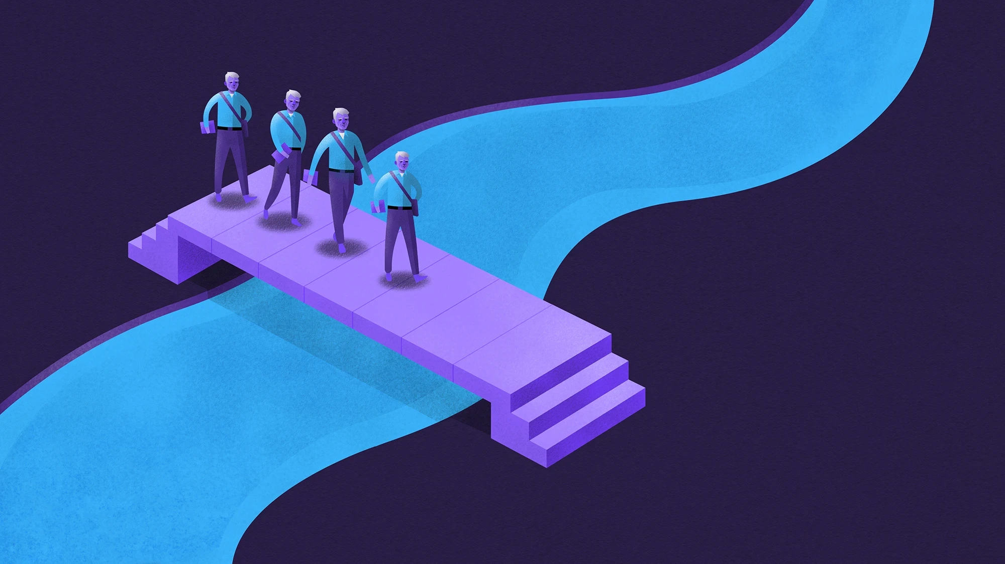
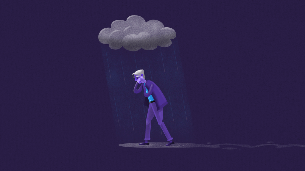
Illustrating what should never be ignored
For White Ribbon Day, we combined hand-drawn illustration, stop motion animation, and the raw honesty of the human voice to bring this story to life. Each element, simple on its own, comes together to create something deeply affecting. The imperfect lines, frame-by-frame movement, and quiet strength of the narration form a powerful visual language that speaks to lived experience and the urgency of change.
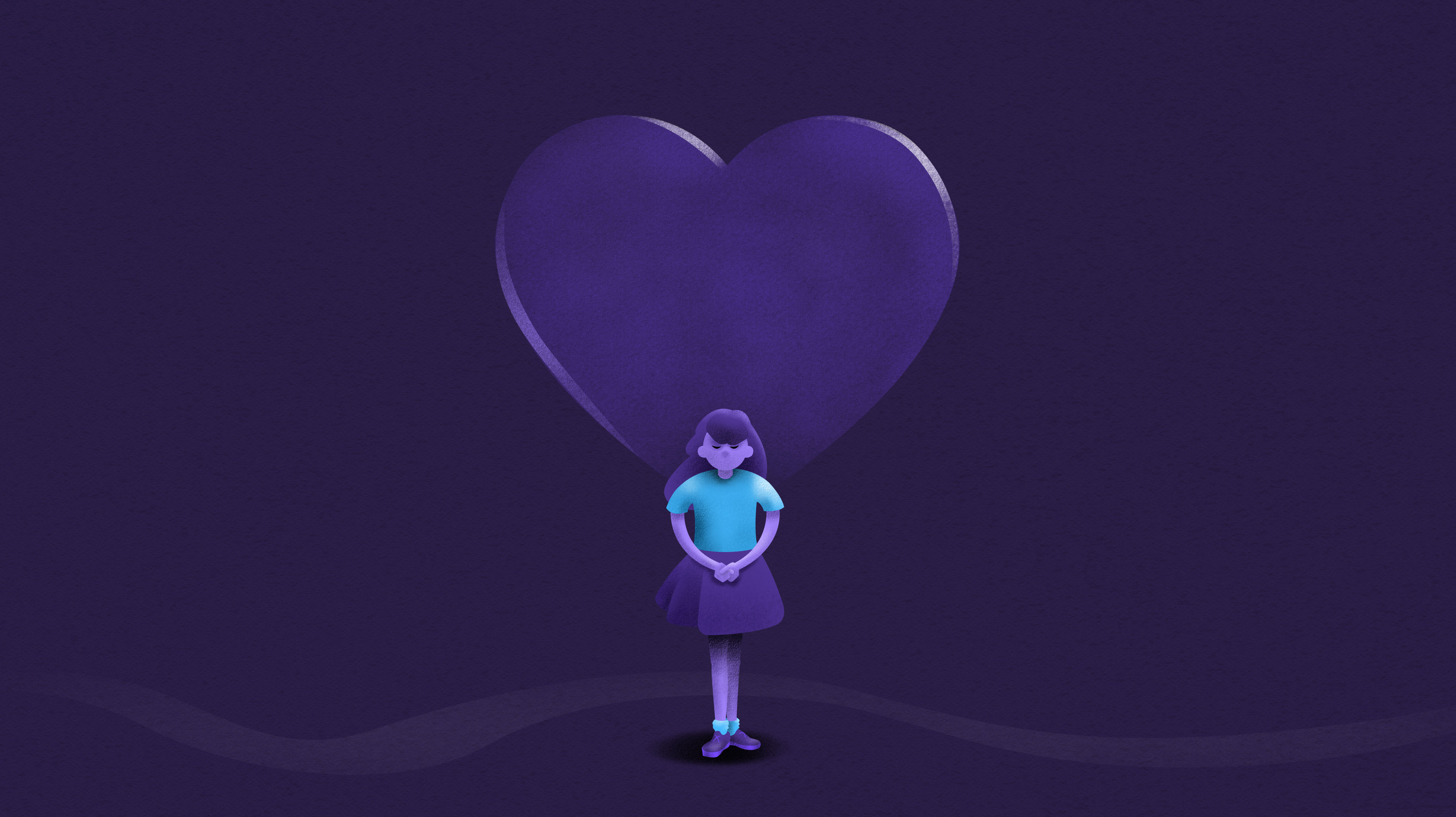
A palette with purpose
The film’s palette of deep purples and vibrant turquoise brings emotional depth and resonance. The purples convey seriousness and reflection, while the turquoise adds a sense of clarity and hope. Together, they balance weight and light; supporting a message that’s both confronting and forward-looking.

John Lenneberg
Creative Director, Moniker Creative

Where lines become language
The process began with loose sketches to explore tone, mood, and flow. We experimented with styles, composition, and pacing to find what best carried the message. After refining, we landed on key illustrated scenes that captured the story’s vulnerability and strength.


The motion is in the details
Each scene was broken into multiple frames and carefully rigged for animation. By isolating and layering key elements, we created subtle, expressive motion that brought the illustrations to life.