BE GROUP
Under visionary leadership championing innovation and strategic expansion, the organisation embarked on a transformational journey — building a bold, future-ready brand engineered to accelerate growth and power breakthrough innovation that changes lives.

INTRO
A non-profit organisation with growing pains and impressive ambitions in research and individual wellbeing. We're here to help.
ABOUT
Many non-profit organizations find it challenging to effectively convey the breadth of their services and their overall impact. ComLink, primarily recognised for its transport services, required a complete rebrand—including a new name, visual identity, and strategic positioning—to better represent its expanded scope of home care, social support, and community engagement services, all unified by a focus on individual wellbeing.
Agency
JSACreative
Strategy before spotlight
Through robust workshops and by listening to the people who live and breathe the business today and who understood its future ambitions — we shaped the direction for what would become the new brand.
Brand story.
Brand idea.
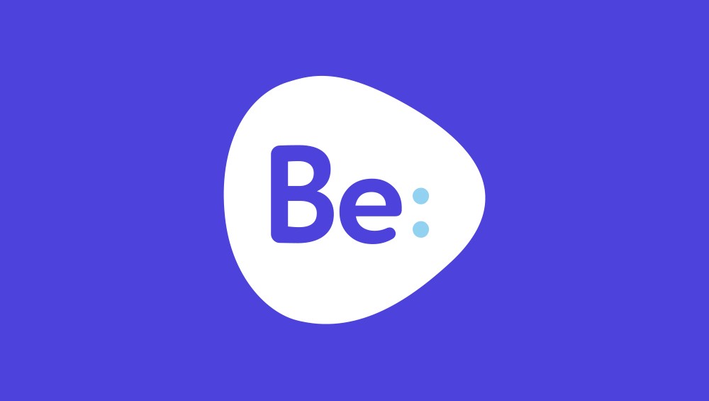
What makes a name? Meet 'Be'
Be’s strength as a word-mark is that there is always an intent, action or a result associated with it.
It's present for the here and now. Be:together, Be:smart, Be:connected, Be:here, Be:home. Be:informed. Be:happy. As if it's the difference between clients just “living” and truly “being alive”.
It has a wonderful sense of optimism and speaks to consumer control, choice and independence. And this name speaks to the flexibility of your business model to be whatever you want to “be”.

Let’s bring Be, to life.
A logo is not your brand. Your brand is the experience your customers have with you across every touchpoint. So, for Be, we set out to create a friendly, approachable logo and identity system that could easily scale over time.

Putting this all together.
We’re excited with the results because it puts the focus on telling the story of what’s next with Be; be it education, research or community care; and the colon as a punctuation mark signifies the beginning of something — a conversation, an experience, a relationship with your customers.


John Lenneberg
Creative Director, Moniker Creative
Clarity in every shade
From the bold logo to the vibrant colour palette, this brand does just as much talking through its visuals as it does through its words. Every detail sets the tone for what we design — all carefully crafted to leave a lasting impression.
#4d42db
#94d1f2
#ffd987
#fafafa
Elements of style.
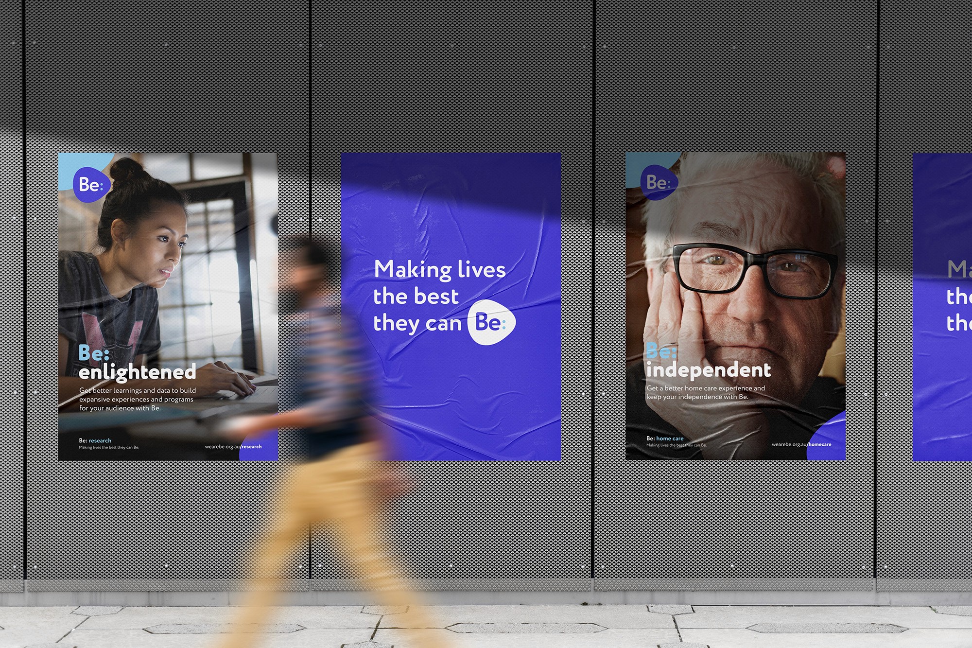
A brand in action.
Here are some examples of the brand foundation in action. All these pieces come together to create a consistent and recognisable look and feel that helps the brand show up clearly wherever it appears.


This brand meets you wherever you are
This brand shows up everywhere; online through social media, and out in the real world on the streets. Whether it’s a post, a pop-up, or a presence at an event, it’s bold, consistent, and unmistakably on-brand